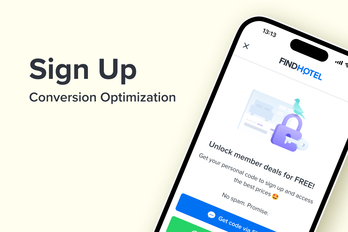
Sign Up Flow Optimization
Step by step plan for optimizing the sign up flow to increase conversion rate
Sign up cover

Problem Space

FindHotel is a hotel booking website recording over 500,000 bookings each month.

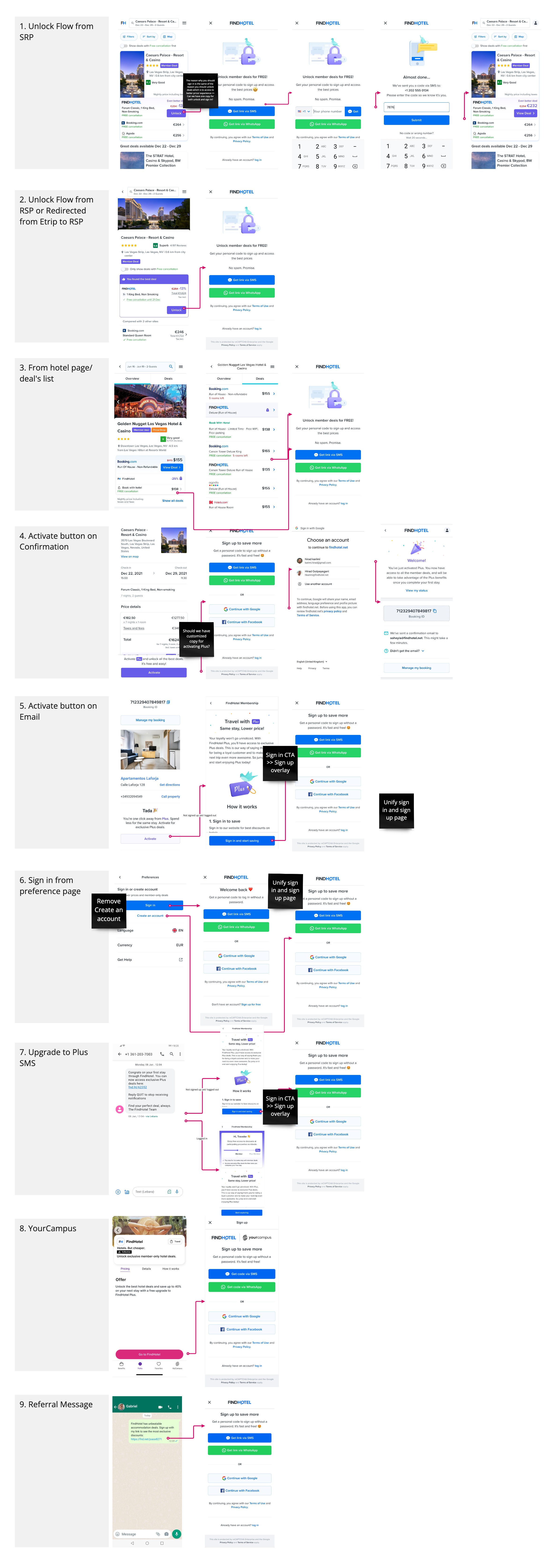
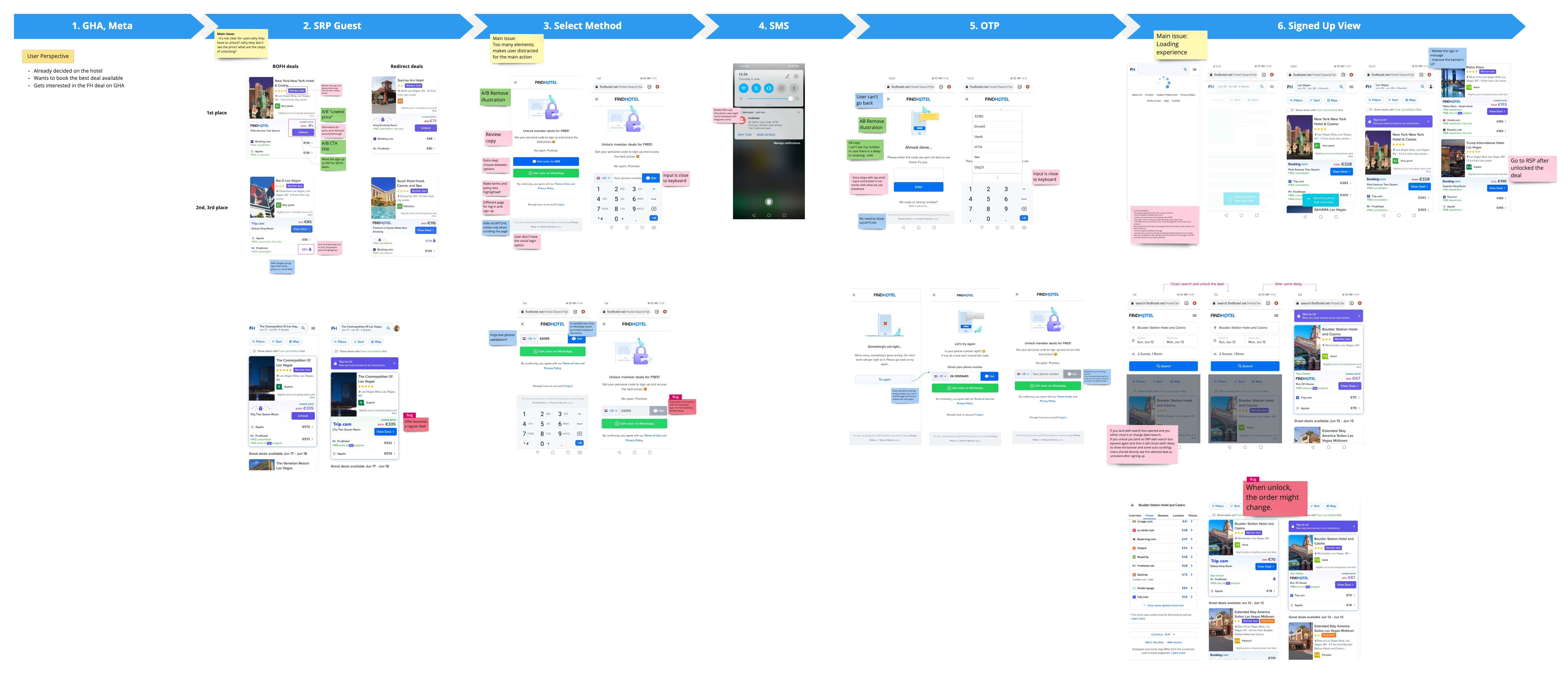
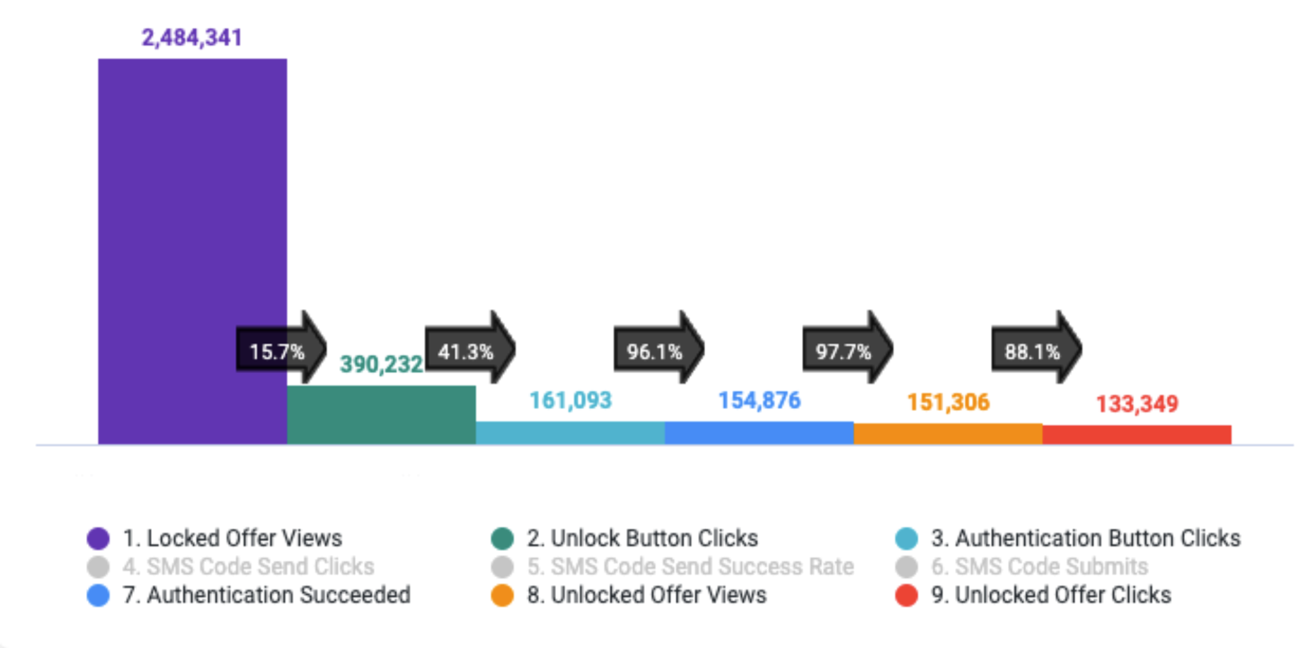
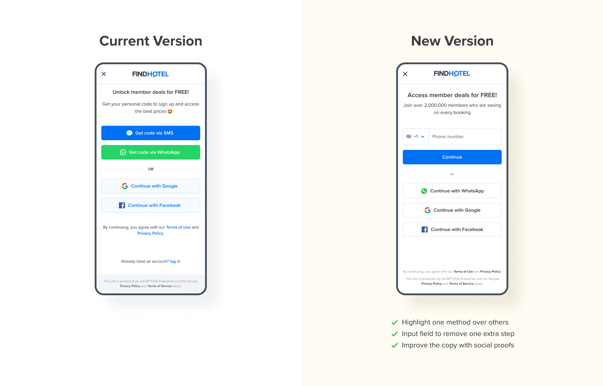
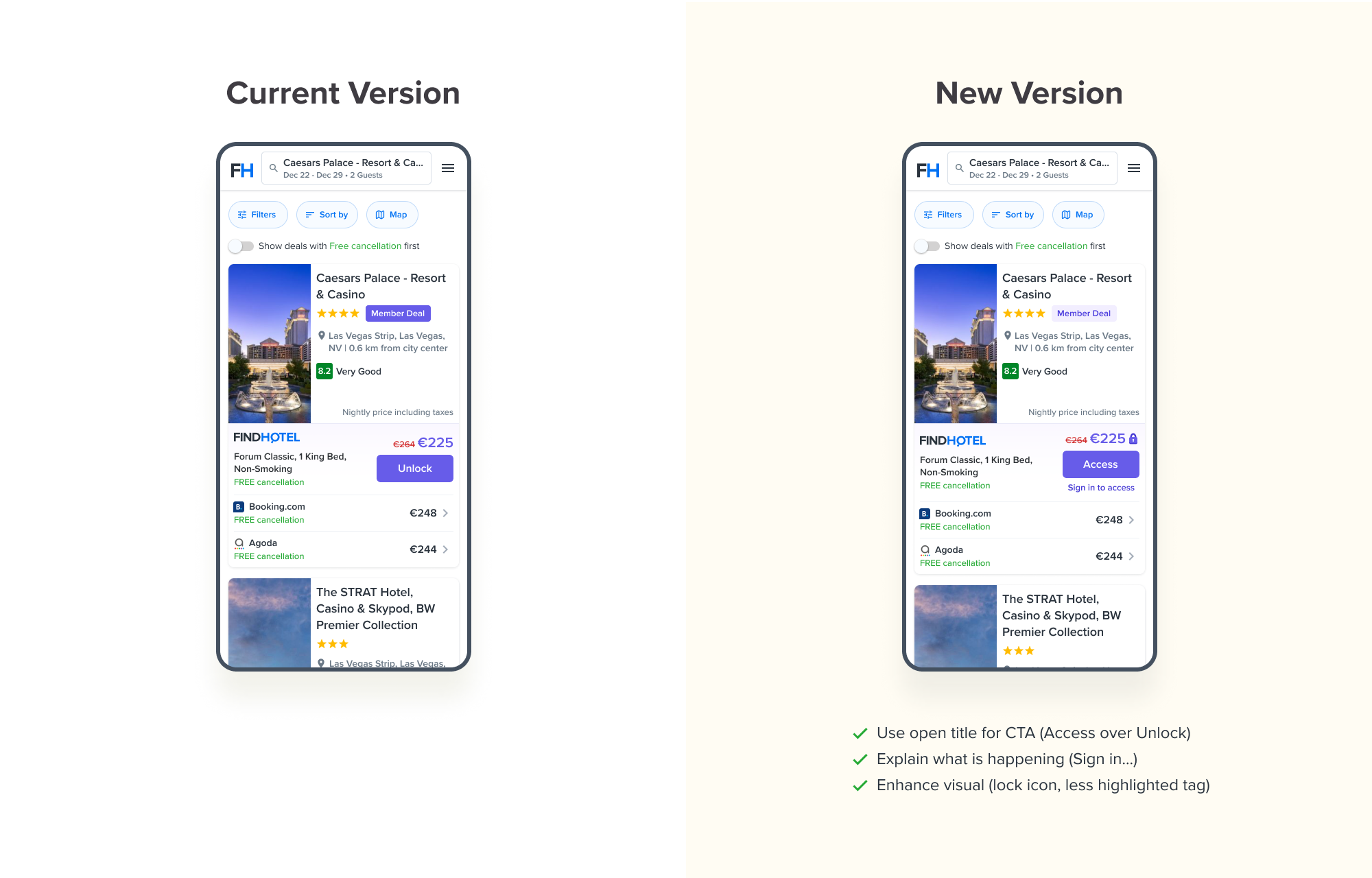
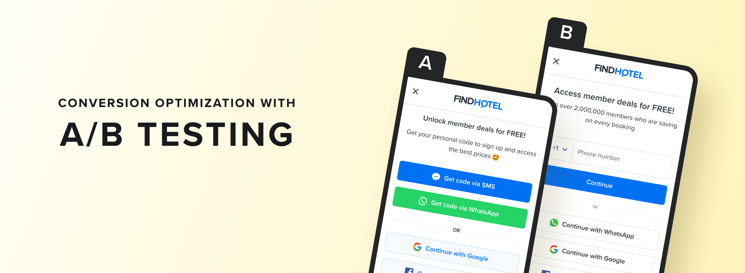
To offer the best exclusive experience for our loyal customers, we reserve our lowest prices for our members. While this creates high value for loyal customers, the need for signing up before accessing these deals discourages many visitors, increasing the churn rate.

One reason is that users often see sign up as a big commitment. So the challenge is to simplify the sign up process and make it effortless for guests to become members and access our top deals.

How might we optimize the sign up flow to improve "private" deals visibility?

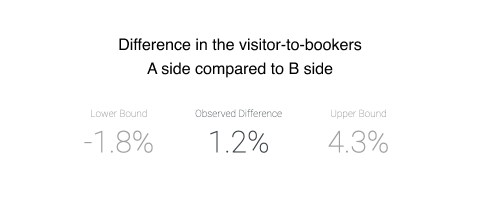
If you found this interesting, let's see how we did it.

My Role
Product Designer
contribution
User Journey Mapping
Define AB Tests
Platform
Responsive Website
(Mobile and Desktop)
team
1x Product Manager
1x Product Designer
1x Product Analyst
1x UX Writer
1x Engineer
duration
4 weeks

The Outcome

With some research and discussions I proposed a design were:
- The CTA copy is more inviting (Access over unlock)
- It explains why it's not what user expects (why it's not "View more" or "View deal")
- One sign in option highlighted more over others so help the user to decide easier
- A phone number input field to remove one extra step

These improvements helped with more sign ups and led to an %1.2 increase in the number of daily bookings (more details in Impact Section).

In the Design Iterations section you can see the current version and compare with the new one.

Dive Into The Process

Mapping All The Flows

First thing I needed to check all the scenarios that users can reach to the sign up page. This was mainly required to first zoom out and consider all the possibilities and second helps to make decisions that work across all the scenarios.

I gathered 9 possible flows in the product that users can end up to the sign up page:

Sign up scenarios

Looking at Data

After gathering all the journeys, I asked our data analyst to check which journey accounts for most of the sign ups. We could see that the search page is the main place that users sign up (first flow on the image above) and other scenarios can be put off the radar for the time being.

Brainstorming

Now that we knew where we should focus I met with the team (our product manager, analyst and engineers) and we ideate initiatives that can improve the sign up flow.

Meanwhile our analyst brought insights and could see that the main pain points are the first 2 steps within the flow which are 1) where users need to click the main sign up CTA and 2) where users need to choose the sign up method (SMS, WhatsApp or Google and Facebook).

Unlock flow
Funnel conversion

It was clear that users either don't understand the concept we used (unlocking member deals) or don't like to take the action of unlocking/ signing up. So I broke the challenge down to 2 parts:

1. HMW make it clear and reduce friction to increase the main button click rate?
2. HMW make it more encouraging for users to sign up with us?

Benchmarking

To make sure that we gathered all the opportunities, I also checked some other website so I can come up make an informed decision.

Sign up benchmark

Design Iterations

Now that I knew what to focus on and how to improve the current state, I prepared a couple of versions. I mainly did 4 things:

- Make the main CTA copy more inviting
- Explain why it's not what user expects (for example why it's not "View more" or "View deal")
- Reduce the sign in options by highlighting one method (SMS) over others so help the user to decide easier.
- Put phone number input field to remove one extra step

New sign upChanges in search page

The Impact

The improvements helped with more sign ups and led to an %1.2 increase in number of daily bookings.

AB test result

Check Other Works

How I helped FindHotel increase the number of returning customer

View project

Step by step plan for optimizing the sign up flow to increase conversion rate

View project
Tetherland Cover

P2P cryptocurrency trading panel I designed for Tetherland.com

View projects

Auction-based website for buying and selling artworks

View projects

Check +15 more cases on my Behance profile

View projects