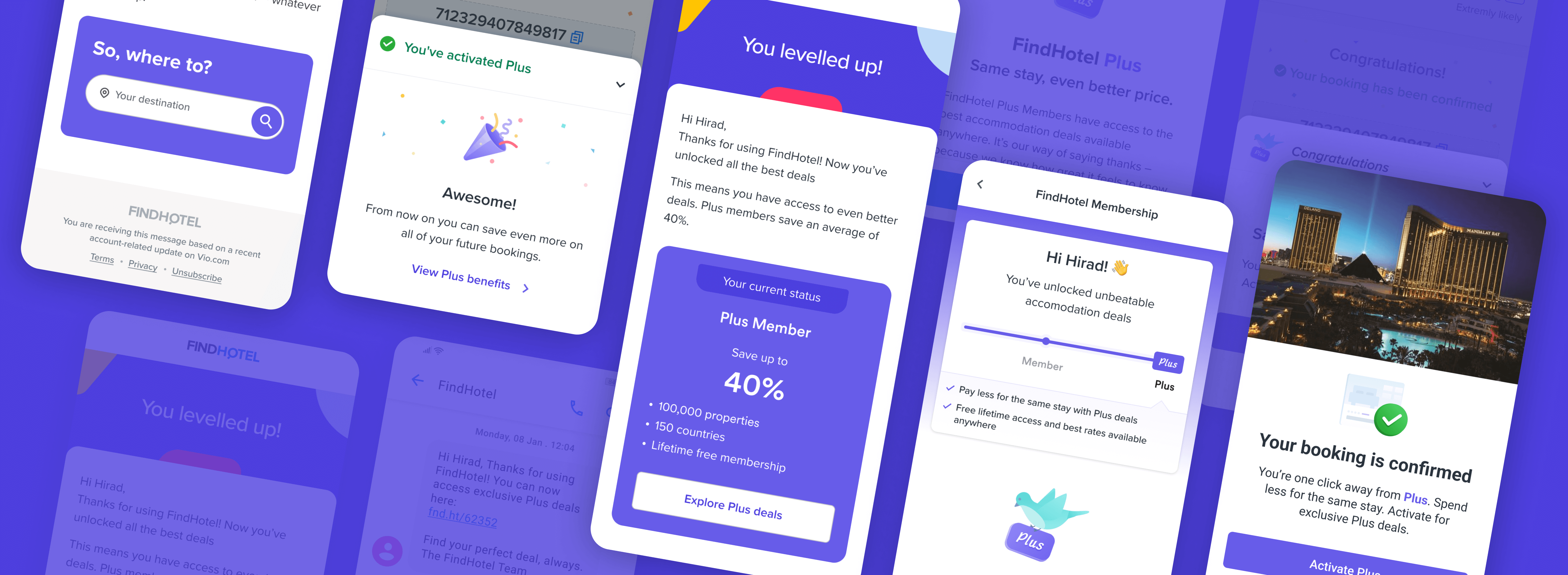
Problem Space
FindHotel (now Vio.com) brings together the best hotel deals around the globe. On FindHotel users can access the best deals not available elsewhere.
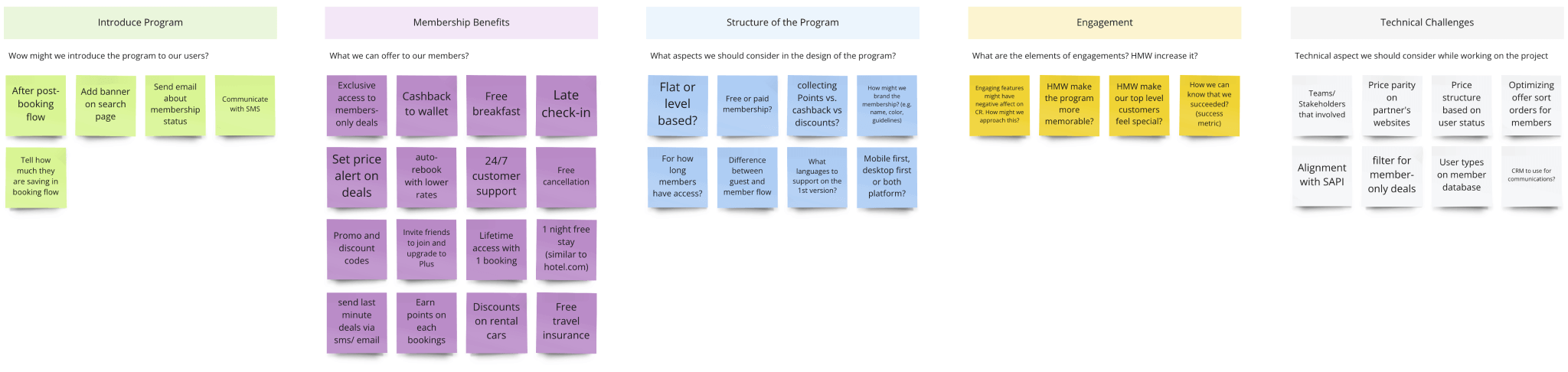
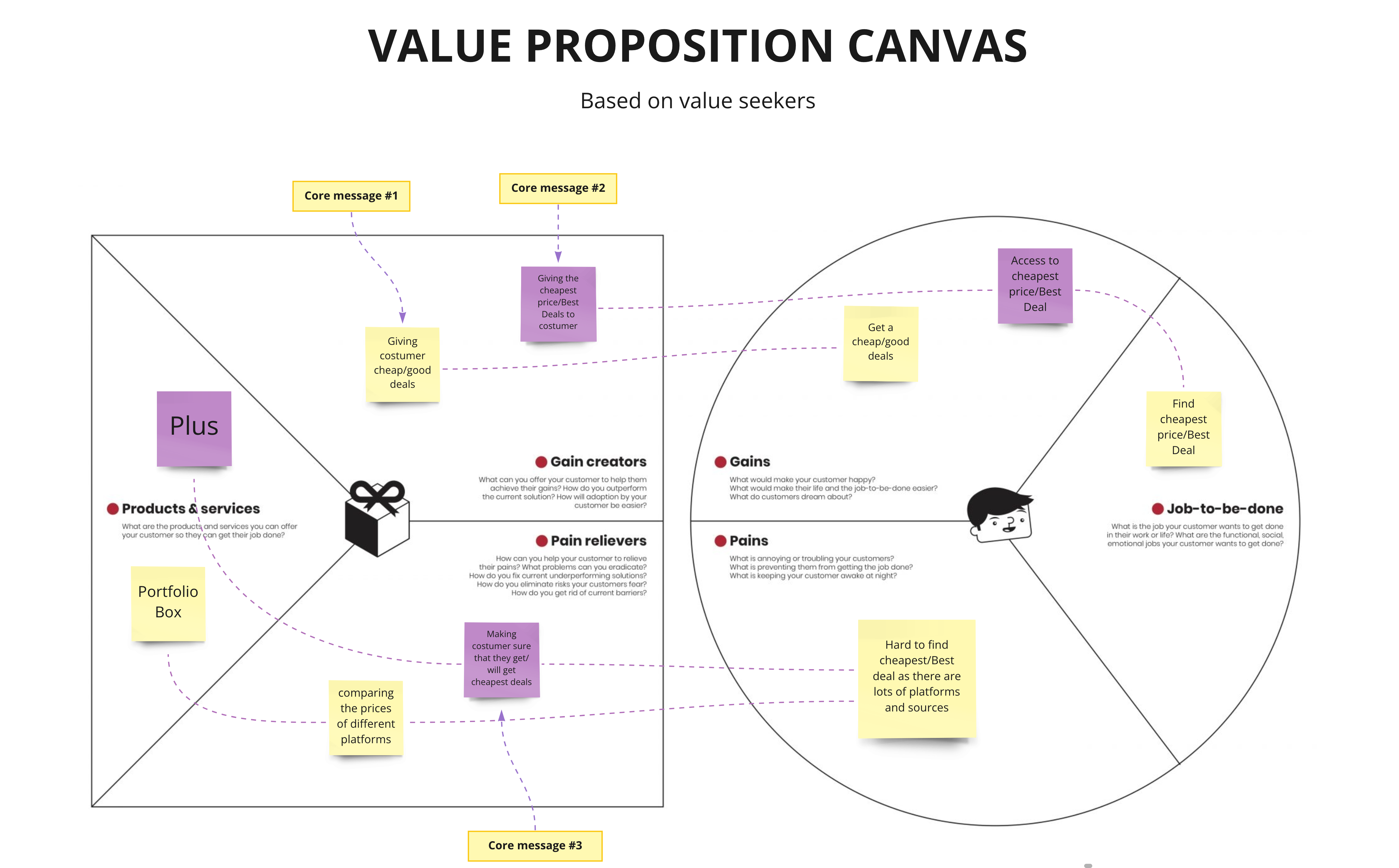
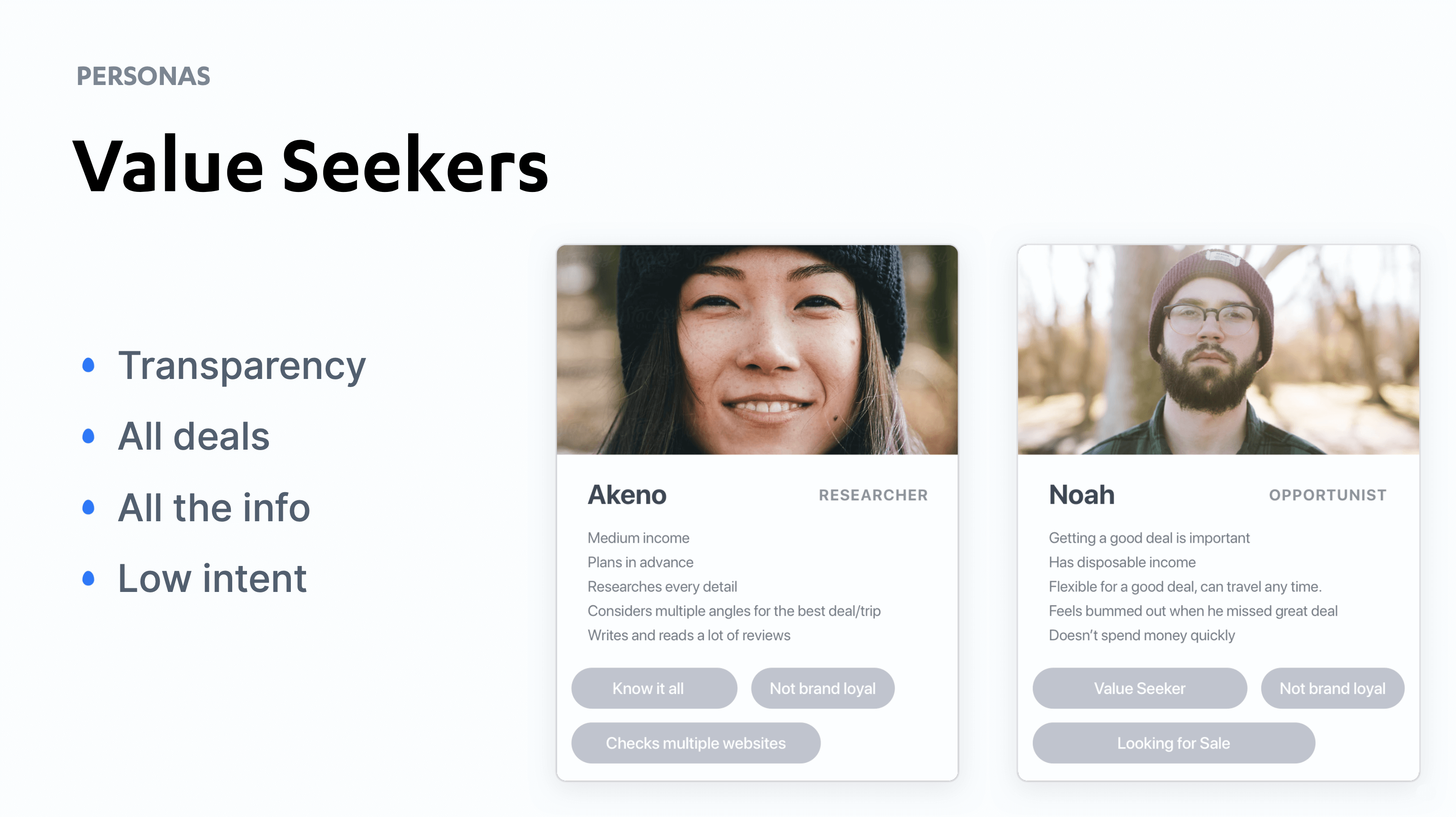
In hotel booking industry, one nature of the user behavior is that once travelers decide the desired location/ accommodation, they always want to find the best prices. So even if they've already booked multiple times through a website before, they still don't mind booking elsewhere if there is a better price. That's why having experiences i.e. membership programs that help build trust and loyalty is crucial in booking platforms. So the challenge was:
How might we design a membership experience that encourages our customers to book again with us?
Product/ UX Metrics
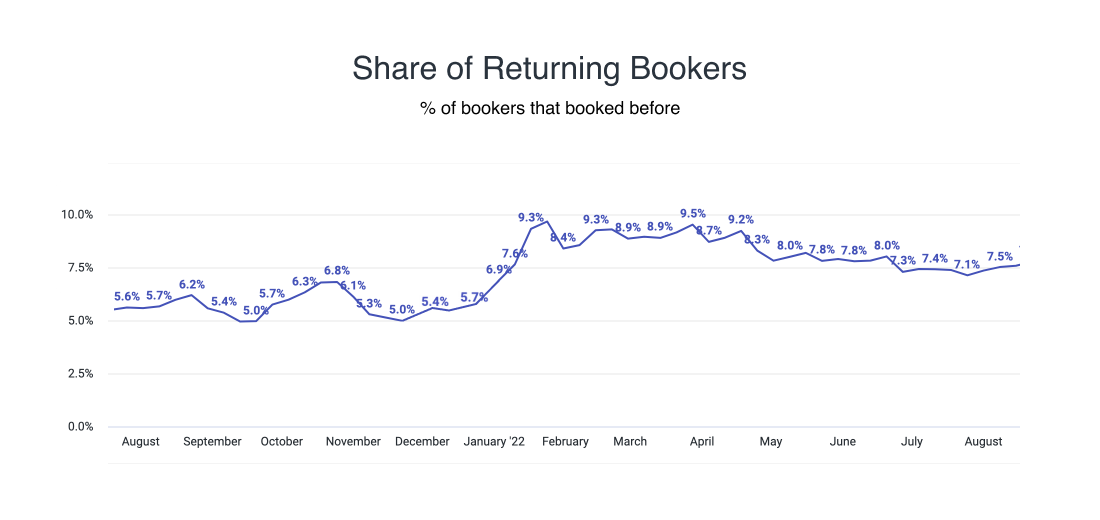
Based on the HMW statement, we set the number of 2nd-time bookings as our main metric. If we could increase that, it's a good indicator that the solution is impacting the user behaviour and we're increasing the loyalty within the product.
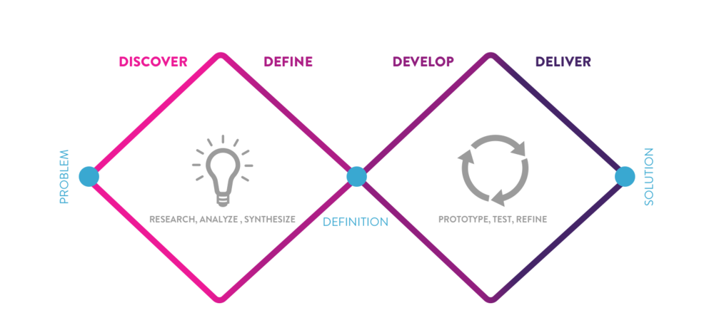
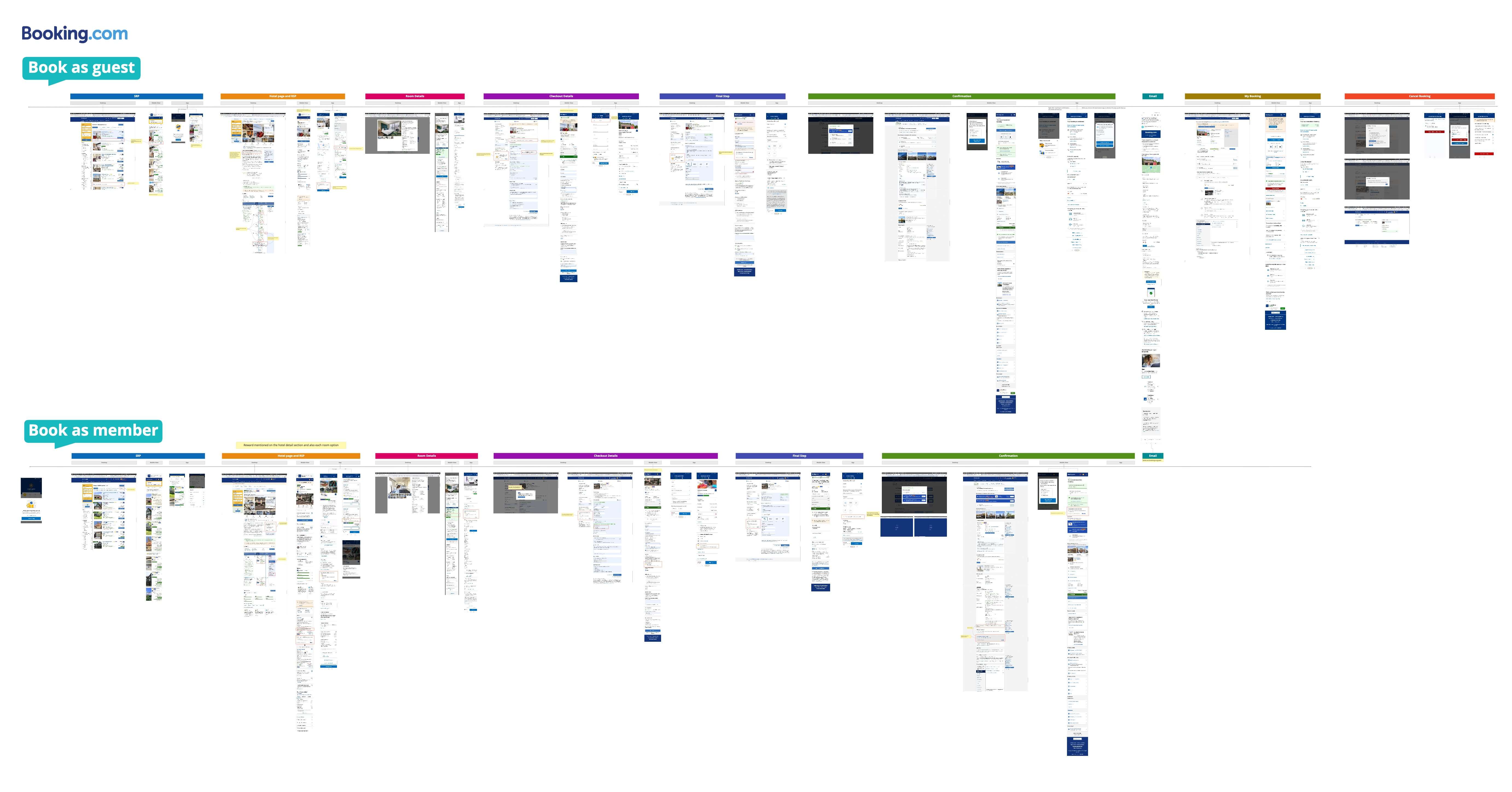
User Journey Mapping
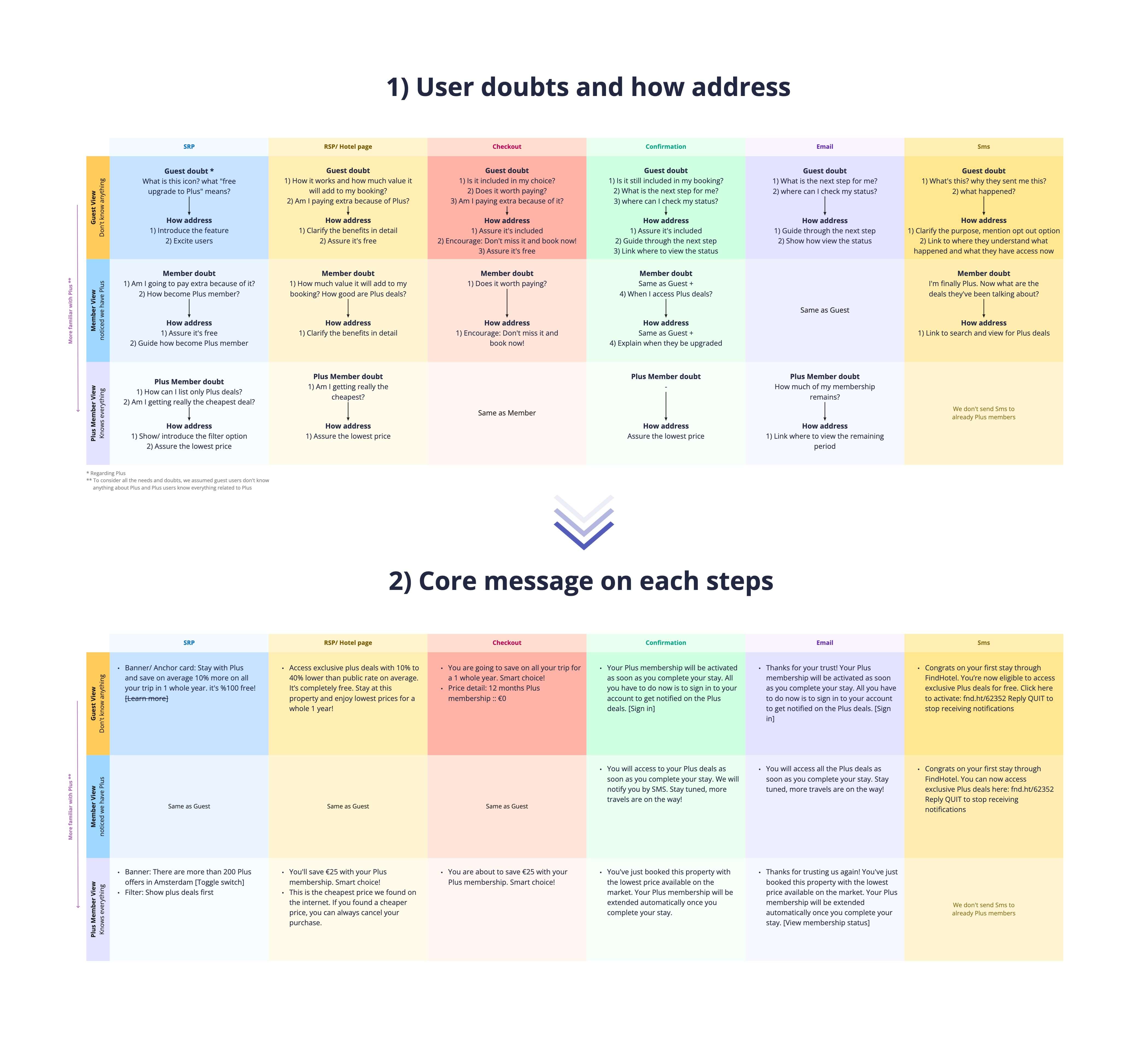
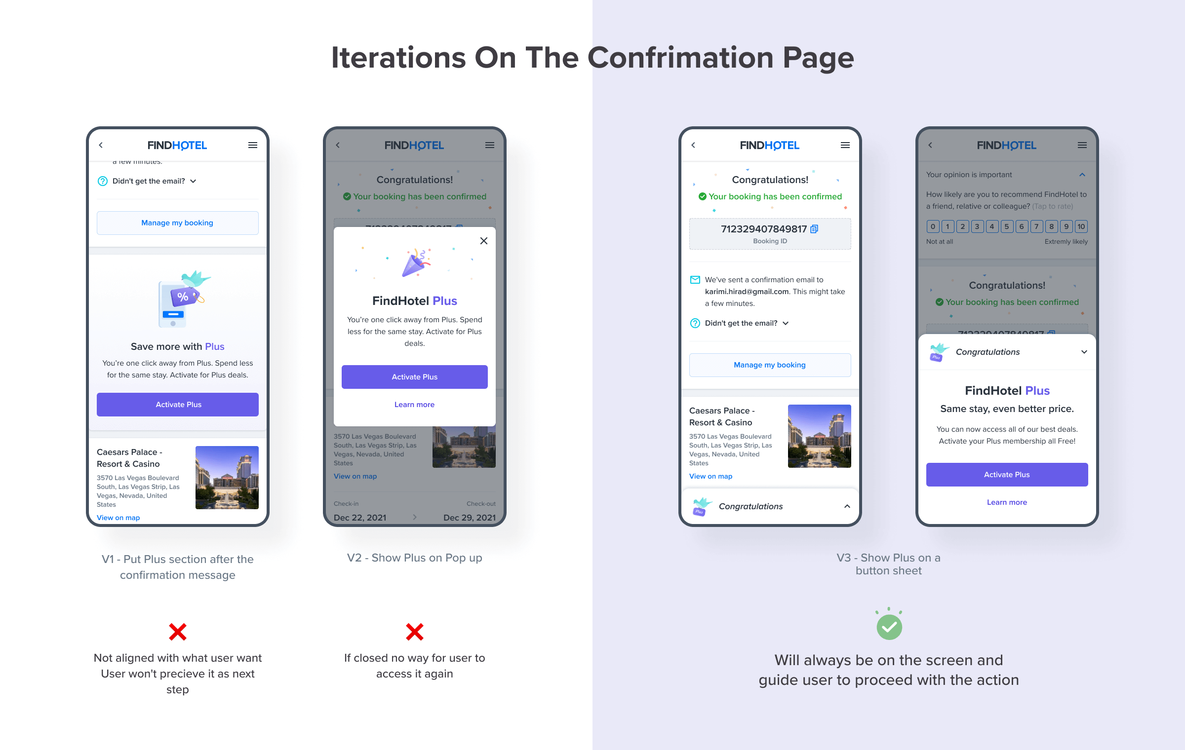
End-to-End Design
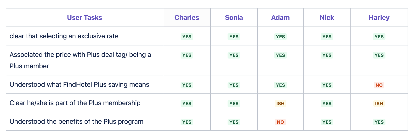
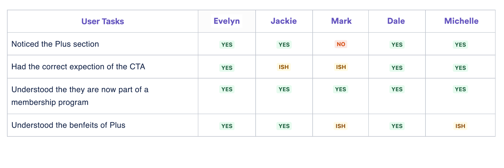
Feedback Sessions
Design QA
(Mobile and Desktop)
1x Product Designer
1x User Researcher
1x Data Analyst
1x UX Writer
4x Engineer